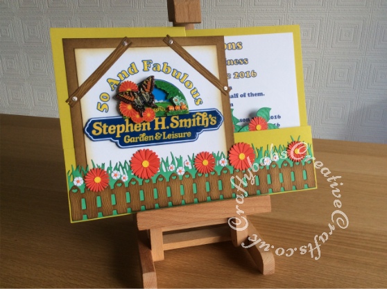
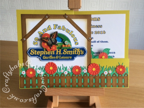
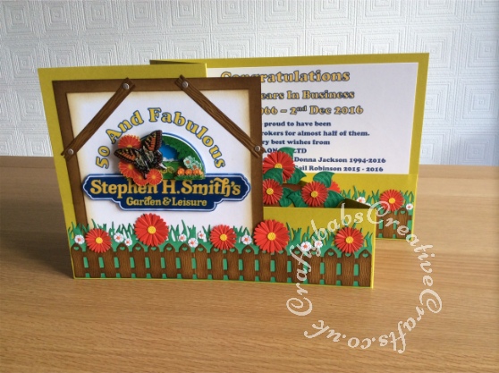
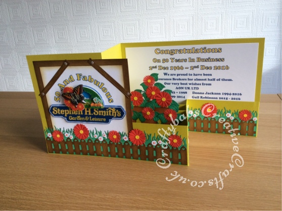
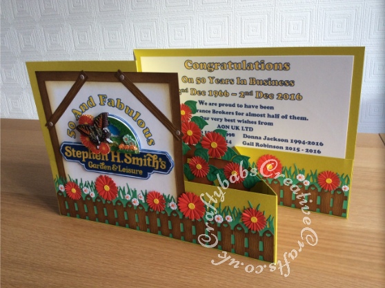
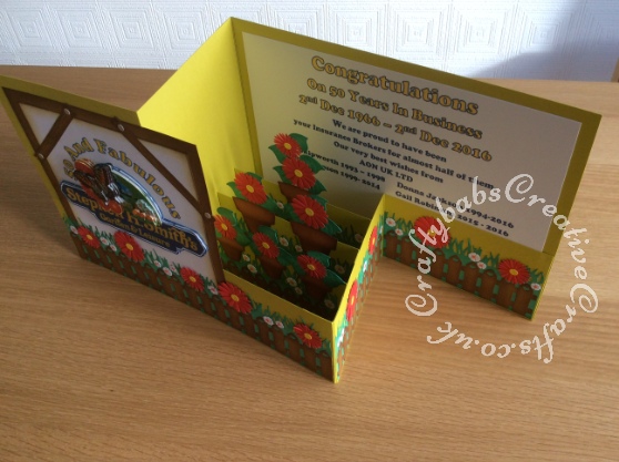
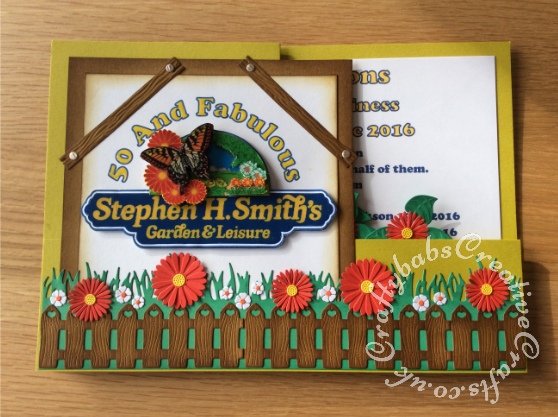
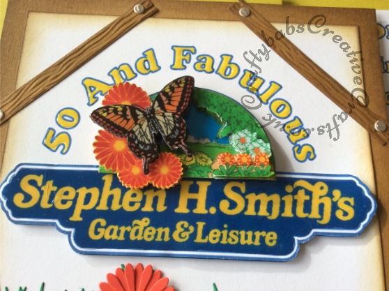
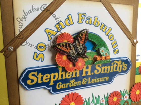
One of the best things about hand-making cards is that you can make something as unique and individual as the occasion and recipient. This card was a commission to celebrate a significant anniversary for a business. I would not advocate the use of company logos in your card-making for obvious copyright reasons. In this instance, the logo was used to send to the same business so I took the chance, and will not be re-using the logo for any other purpose. The card is an A4 version of the double ‘Z’ fold card that I have come to love. I made the the base card using 3 sheets of A4 300 gsm card. 1 sheet for the the back, 1 folded in half for the front and 1 sheet cut down to make the 2nd ‘Z’, a hinge to join the front to the back and the supports for the pop up elements. I used Craftartist professional2 software to create the decoupaged logo and also the sentiment. Once decoupaged, I used Anita’s 3D gloss on the decoupage and the front sentiment. The pop up section was created in the same way as you do a pop up box card. I took my inspiration for the flowers and colours used from the logo to create a co-ordinated look. For details of all the different dies I used, just click on the individual pictures. I really enjoyed creating this card and love the extra dimension that adding the pop up elements gives.
